This project is a deep dive into the unique characteristics and applications of three iconic typefaces: Paralucent, Benton Modern, and Miller Headline. Each font was analyzed and showcased for its distinctive qualities, offering insight into how designers can strategically use typography to achieve specific functions and evoke particular aesthetics.
Deliverables include:
A poster, presenting each typeface alongside its full family, demonstrating versatility and practical applications.
A dynamic typographic video, animating the defining characteristics of each typeface to highlight their expressive potential in motion.
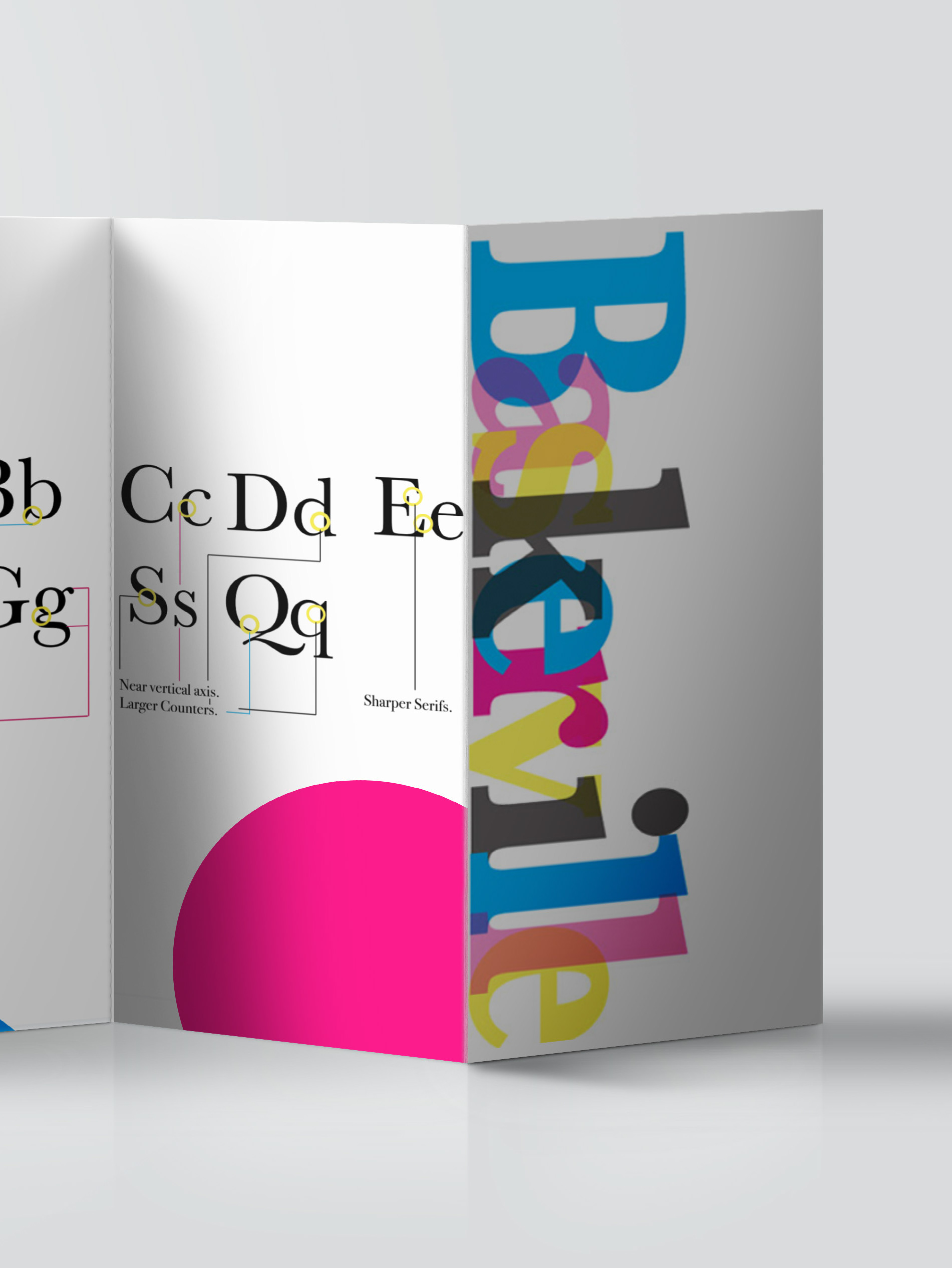
A typographic booklet, providing a comprehensive study of these fonts, exploring their design histories, functional versatility, and aesthetic impact.
This project reflects my dedication to mastering the subtleties of typography and my ability to convey the power of design through multiple mediums. By showcasing the harmony between form and function, this work emphasizes how typography can elevate communication and enhance storytelling.
I’m excited to bring my expertise in typography, motion graphics, and editorial design to your team, crafting compelling visual narratives that resonate and inspire.
This was an experiment with one of my favorite tools of designing, typography! I made this video to showcase three fonts that I find extremely functional and beautiful, accompied with a 20x24 poster & an 8 Paged paginated book!
