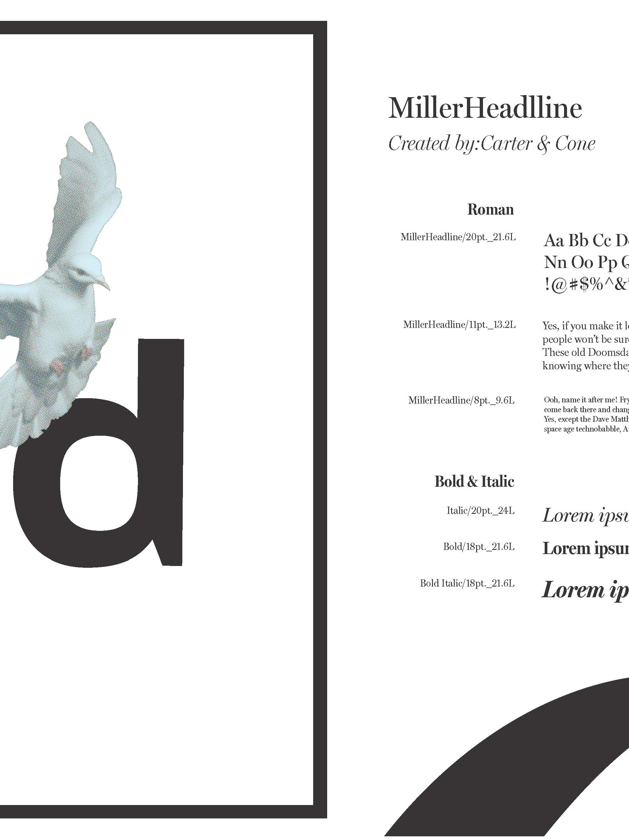
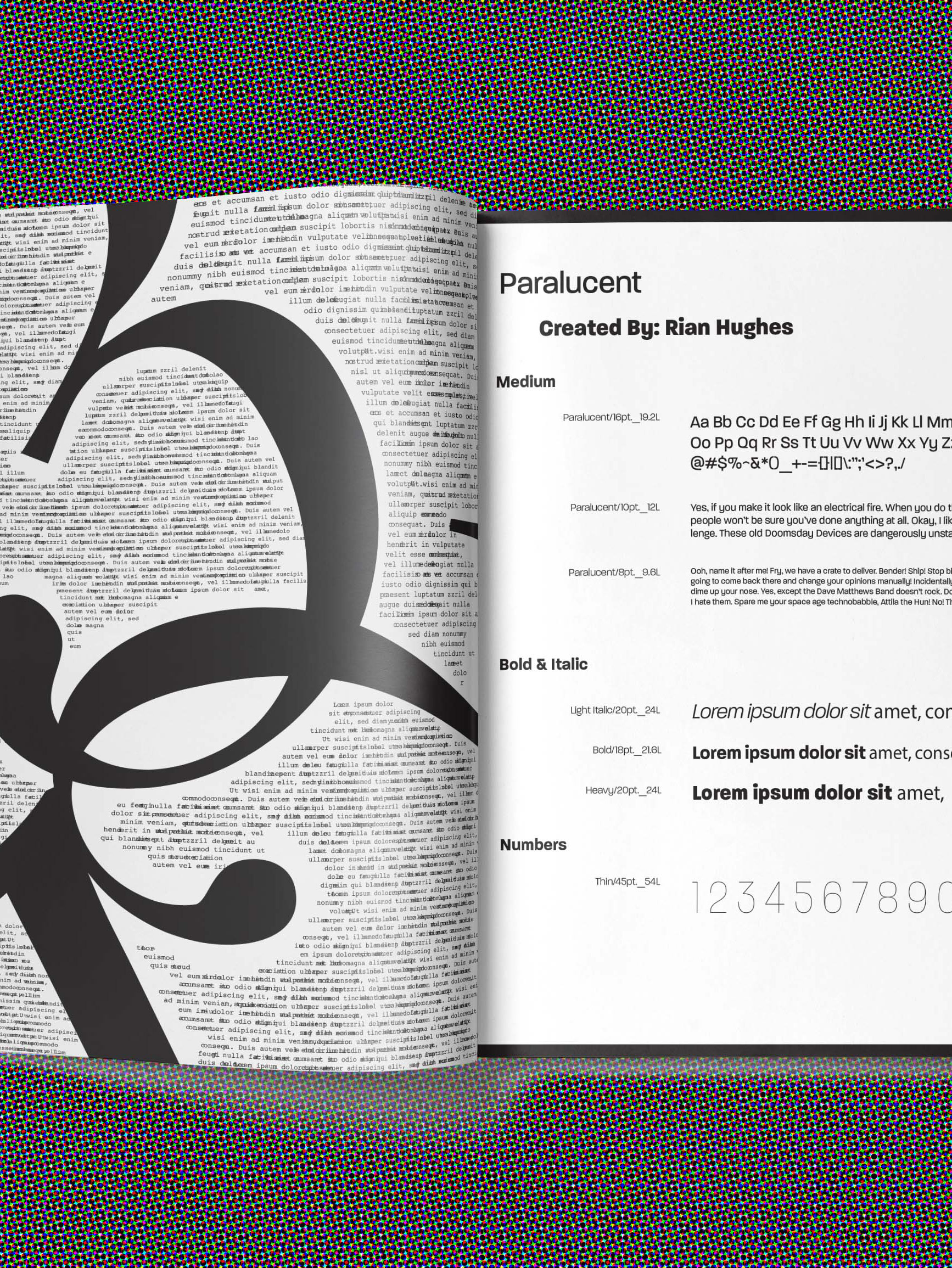
This project involved creating a magazine layout for an exhibit on wildflowers at Phipps Conservatory, with a focus on integrating typography and imagery to bring the beauty of nature to life. I utilized three classic magazine layouts—Mondrian, Silhouette, and Picture Window—to craft a dynamic and visually appealing design that effectively communicated the essence of the exhibit.
Each layout was chosen to best highlight the natural beauty of the wildflowers while providing a structured, easy-to-navigate reading experience. The Mondrian layout offered a balanced, grid-based approach, the Silhouette layout allowed the flowers to take center stage with bold, dramatic visuals, and the Picture Window layout created an immersive experience, framing images in a way that drew the reader’s eye to both the visuals and the accompanying text.
This project showcases my ability to combine strong typographic skills with a keen eye for composition and layout, ensuring that each element works together to create a cohesive, engaging experience for the reader. It reflects my understanding of design principles and my ability to adapt different styles to suit a specific theme or audience.
If you're looking for a graphic designer who can create visually compelling and well-organized layouts, while effectively blending type and image to enhance the storytelling experience, I would love to bring my skills and creativity to your team. Let's collaborate to produce designs that captivate and inspire.

